Blog Essay Class 15

When I first encountered Snow Fall in 2012, I wasn’t sure what to make of it. I appreciated the out-of-the-box approach to online news design, but I felt that I couldn’t give the presentation a fair shake because of the way I like to read long pieces like these. Just as I got into the rhythm of the story, I found my attention diverted to sidebar items that competing for primacy. I have to stop and make decisions and guess about the editor/writer/producer’s intentions. Will seeing this particular slideshow at this point in the copy add to my understanding of the text I just read? Is the exposition contained in the avalanche science video necessary to comprehend what comes next, or just extra information for those who want more scientific underpinnings at that point in the story? Were these multimedia items chosen for insertion at this particular point because they are setting up the a narrative, or did they make a design decision to insert something at this particular point of the page? This multimedia format grafted on to the structure of a traditional narrative story worked less well for me than other non-linear multimedia stories I have seen. When enveloped in a narrative, I want to forget that I am reading and just experience the story. I don’t want to be pulled out of the reverie by links and sidebars. It was gratifying, then, to learn that I was not the only one to have issues with Snow Fall’s magnificence. Roy Peter Clark agrees with me on many points, and makes some additional notable arguments that the multimedia items burgle the narrative.

Is literary journalism the last, best hope of newspapers? I would argue that it is not the whole answer, but perhaps part of it. I believe that newspapers have one advantage over faster media, which is that they can cover local issues in a way no other medium can or will. Television and radio formats don’t allow for a long look at anything. That look doesn’t have to be literary, but it does have to be longer than a 60-second story to really knit a community together. I believe this gets to the point of Voices of a Nation more than the style of writing does. After all, we are not so much exploring what it means to be American, a mythic and monolithic class that may or may not exist, but what it means to be part of our smaller, more knowable corner of the world. The New York Times I receive on Sundays covers all kinds of news, but it is still very much about what it is like to be a New Yorker. If it stopped being that, I would be less interested…and I’m not even a New Yorker. In local and regional outlets, the shaping presence of the writer has as much to do with their individuality as their geography.

So how important is a writer’s position on the lit-J continuum? Here’s one version:

<–Agee     Capote       Wolfe      Didion   Crane    Orwell   Ross       Mitchell     McPhee      Hersey–>

I didn’t approach this class feeling that it was necessary to strictly define literary journalism. I wanted to learn more about its techniques so that I could use what was helpful, compelling and boundary-pushing in my own work. But I don’t want to push boundaries for the sake of pushing boundaries, only to make it more interesting and compelling to readers. Some of what we read this semester puts artistry ahead of reader experience, and while that’s interesting from an artistic perspective, I don’t admire it. It smacks of showing off.

Class summary: Overall a good experience. Class discussions were interesting and taking turns leading them worked well. I liked the small size of the class and having interesting classmates. International perspectives from your overseas experiences were a welcome addition. Readings were varied and well written, though I didn’t get much from reading or writing about The Emperor. The readings seemed a bit top-heavy in the early history of literary journalism at the expense of more modern pieces.

Mechanics: I appreciated the affordability of the books and the fact that we used all of them thoroughly. I’m not sure why the syllabus said to bring a laptop or tablet to every class when we never used it. Ditto with printing the blog posts. Why not just use the laptop or tablet to refer to the blog posts if we are bringing them to class? The mandated Tumblr and Twitter follows were a lot of extra reading that we didn’t address in class. The “On Writing” readings were some of the most interesting ones, but we didn’t write about or discuss them. Having fewer history and/or literary journalism readings would open up time for more emphasis on those.

2) Link

http://blog.longreads.com/2013/09/27/required-reading-from-journalism-professors/

Check out #6!

3) DQ

If you could have the literary talents of one writer from the syllabus, who would it be?

Alisson Clark

alissonc@ufl.edu

Video tips for photographers

Ken Kobré offers tips for photographers making the jump from still to video in his book “Photojournalism: The Professionals’ Approach,” calling on pioneering multimedia journalists for their perspectives. Some take-aways:

  1. When beginning in video, do yourself a favor and choose a character-driven topic with a willing subject whose story lends itself to visual representation (pg. 308).
  2. ‘Platypus’ is a fun synonym for a one-man band, which in the context of journalism is a backpack reporter who can capture audio, shoot video and stills, even write and edit (pg. 309).
  3. Context — a series of related moments rather than a discrete single frame — is more important in video than in still photography, so moving from one to the other requires a different mindset (pg. 314).
  4. Kobré says external mics and headphones — not earbuds — are a must. I struggle with this when interviewing because headphones seem to isolate the interviewer from the subject. It feels like you are not listening when you’re ensconced in over-the-ear headphones (pg. 320).
  5. Avoid zooming unless there’s a narrative payoff for the viewer. It’s amateurish and unnatural and is more satisfying for the videographer than the audience (pg. 322-4).
  6. For ease of editing, let every shot roll for a minumum of 10 seconds (pg. 324).
  7. When it’s time for organizing what you’ve shot with your editing software, slice scenes into clips and sort clips into bins. Name clips and bins precisely to aid in editing. Make sub-bins with a maximum of 20 clips if bins become unwieldy (pg. 328-329).
  8. B-roll that simply decorates and doesn’t advance the plot is referred to as wallpaper, and, like most wallpaper, is best avoided (pg. 330).
  9. Don’t overdo transitions. Straight cuts and dissolves are the only tools that really need to be in your transition arsenal. However, be careful to avoid jump cuts where two pieces of similar footage are cut together and cause the subject to jump in the frame from one position to another. Footage of the person’s hands, B roll or other cutaways can help (pg. 328, 332).

Barley, Hops and Grassroots

In 2008, recent college grad Luke Kemper recruited a family friend known for his home-brews to launch Swamp Head Brewery in Gainesville, Fla. Their beers are now on tap from the Florida Panhandle south to Naples, and Kemper dreams of even wider distribution. But how does a grassroots company manage exponential growth and spiraling demand while maintaining its sustainable indie ethos? How Kemper finds that balance intrigued me and inspired a closer look.

An immigrant story upended

Jon Kasbe’s piece “Not at Home,” a multimedia portrayal of a New York family that has relocated to the Galápagos Islands, provides an incredibly intimate insight into a family’s hopes and challenges in a new place. It inverts the typical immigrant story of transitioning from village ways to city life, to gripping effect.

Kasbe shows us the intense vulnerability of a mother and her children displaced (voluntarily on the mother’s part, less so for the kids). She’s in search of a better life for her family, but her doubt and struggle come through in every frame, matched only by her overarching determination to make this choice work.

By quick-cutting video clips from different settings into the introduction, Kasbe piques our curiosity by dropping us into the fabric of their daily lives and the mother’s internal monologue. We get a sense of place from scene-setting footage as well as insight on the family’s new life from interviews and shots of their everyday activities in this exotic setting. Lower thirds accomplish the task of narration without introducing an outsider’s voice to distract from the family’s story. Natural sound of cooking, swimming and a heart-wrenching phone call from home help fill in the picture.

The audio and visuals of the interviews show the trust Kasbe engendered in his subjects, through both the feelings they choose to reveal and the moments he had access to. Iris, the mother, says she is extremely protective, understandable given what she reveals about her past. It speaks volumes about Kasbe’s skill and sensitivity that she not only allows access to these moments with her children, but to her most painful memories and deepest fears, as well.

I was curious about the enormously talented Kasbe, who garnered two honorable mentions in the multimedia feature category of the 2013 National Press Photographers’ Best of Photojournalism Awards. Digging for more information, I found his resumé and discovered that Kasbe filmed this piece in a week while he was still a student of media production at University of North Carolina at Chapel Hill. I expect he’ll be winning a lot more of these awards for whatever media outlet scoops him up.

Developing an eye (and ear) for detail

As multimedia reporter or editor, your attention to detail can make or break a piece. As I began an audio/photo slideshow project, I consulted Jonathan Kern’s “Sound Reporting” and Ken Kobré’s “Photojournalism: The Professionals’ Approach” for tips.

Kern explained the many roles and responsibilities of public radio editors.

  1. Editors advise and oversee the structure, delivery, angle, sound quality and development of a reporter’s story. They ensure that the final product uses meaningful actualities and ambience that advance the story and are not just set dressing. They must avoid the temptation to string together appealing sound bites at the expense of coherent story. They also fact-check (pgs. 92-93, 97 and 114).
  2. Editor/reporter collaboration works best when it’s done from the start (pg. 93).
  3. Editors can help reporters hone the focus statement of their story to develop a strong angle (pg. 94).
  4. A story can be structured vertically (a deep dive into a narrow area) or horizontally (a wider-ranging overview) (pg. 94).
  5. Editors prefer to hear a script rather than read it. The wording has to make sense to the ear the first time, as listeners can’t go back and reread (pg. 99).
  6. Opening techniques come in several familiar flavors, but it is important to avoid formulaic clichés (pg. 105-108).
  7. Unlike print, you don’t want to end on an actuality. However, you can successfully mimic the print technique of ending on a quote where appropriate by having the reporter relay the quote (pg. 113).

Kobré’s foray into multimedia offers valuable advice that, while reading, I repeatedly wished I had known before my previous audio projects.

  1. Unplug anything that will hum, buzz or ring before recording. In my short audio career I have already had plenty of great moments ruined by phones and refrigerator compressors (pg. 274).
  2. Place the mic closer than you might think wise: NPR legend Ira Glass recommends 4 inches from the source’s mouth (pg. 275). It’s also advisable to place a recorder with a built-in mic on a soft surface to avoid echo (pg. 276).
  3. Getting good answers for audio requires doing something you’d never do in print interviews: asking questions in pairs. This encourages the source to repeat the question in the answer, leading to more self-contained actualities (pg. 280).

Out in the field: Sound and photo tips from the pros

When I finished j-school in the late ’90s, all you had to do to land a job was to show that you were a quick, reliable and solid writer. Now, a familiarity with sound and photography is almost as important as writing for many positions. To learn more about those aspects of multimedia journalism, I turned again to Jonathan Kern and Kenneth Kobré’s books for perspective.

In Kern’s “Sound Reporting,” I discovered what NPR field producers do:

  1. Field producers tackle a wide range of duties, blending reporting, research, pre-interviewing and gathering sound with booking and organizing forays into the world beyond the studio (page 73-74).
  2. Another key task is to prepare interview subjects for what the experience will be like so they don’t balk when they see several people and a bunch of equipment arriving (page 79).
  3. When gathering sound, recording it at different distances can help producers make a “movie on the radio” when the piece is edited (page 81). Slating sound — giving a spoken description that describes it for your reference later — can help keep track of the natural sound you record.

In Chapter 10 of Kobré’s “Photojournalism: The Professionals’ Approach,” Kobre talks about moving beyond news and portraits to issue photography.

  1. The example about alcohol in America on page 208-211 shows two sides of an issue: how it both helps and harms our society. The photographer doesn’t nudge us to take sides, but shows us both aspects and lets us draw our own conclusions.
  2. Access can be an obstacle for issue stories. Photographer Judy Griesedieck of the San Jose Mercury News got around the issue of nursing-home owners and management who were unwilling to cooperate with her story by connecting with residents who invited her to visit as their guests, which allowed her to have access to the properties she wanted to shoot. This underscores how photojournalists sometimes have to think like investigative reporters (page 207).
  3. The reporting aspect of photography arises again when shooting informative features, Kobré says. Informative features can require photojournalists to develop a beat and maintain contact with an array of experts and stakeholders, as well as following developments in the subject (page 218).

I made a map! (You can, too.)

schools map

Making a map with Fusion Tables is easy: The hard part was getting the data scrubbed up and ready to plot. I spent a long time getting rid of junk data in the Florida Department of Education’s spreadsheet of schools by county. Some schools were listed up to five times, others were homeschooling entries that were not actual schools and lacked addresses. Learning to clean up the labels once the data was geocoded was also very useful, as the display is much more user-friendly and professional-looking once you edit the text with some very basic HTML. The learning curve was steep for me on Excel functions, but I’m really glad I powered through, because the ability to make maps like this is a real asset.

Mastering (or at least demystifying) custom maps

Nathan Yau posits that the intuitive nature of maps makes them one of the most interesting data visualizations for journalist and reader alike. In Chapter 8 of his book “Visualize This: The FlowingData Guide to Design, Visualization, and Statistics,” Yau discusses how to customize online maps into powerful tools for conveying information in an appealing way. The chapter offers specific coding examples as well as suggestions for online tutorials. Some of his key points:

  1. Plenty of free tutorials can get you on the road to creating interactive maps using Google and Microsoft mapping APIs (Specific Locations subhead).
  2. When you want a map that goes with the larger design scheme you’re working with, whether it is print or online, you have to delve deeper than Google and Microsoft custom maps, which are always going to look like their source rather than a more-polished custom map. The first step is turning an address into latitude and longitude with geocoding (Finding Latitude and Longitude subhead).
  3. Choosing a color scheme for your map should be done with the end user in mind, not just to satisfy your aesthetic preferences (Regions subhead). When colors denote increasing concentrations, they should become more saturated as the concentration goes up. Logical color choice doesn’t just make the map better looking, it makes it easier to use.
  4. Much like retrieving data, mapping data can be done through code much faster than if we had to color every county, country or region by hand (Color by Data subhead).
  5. Maps don’t have to be static. Either by using multiple maps or an animated map to show the same place over time, data viz can reveal changes over time in an engaging way (Over Space and Time section). Showing the growth of Walmart locations through an animated map yields a much more visceral representation of mushrooming big-box stores than a line chart or table could possibly provide.

Scraping: Less painful than it sounds

Data journalism used to be for the one person in the newsroom who didn’t hate math.

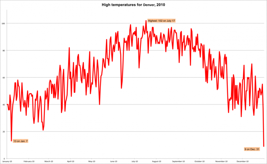
Now it’s a skill set that up-and-coming journalists would do well to have in their arsenals, as more employers are looking to hire data-savvy writers and editors. Nathan Yau’s book “Visualize This: The FlowingData Guide to Design, Visualization, and Statistics” promises to walk journalists through the process of data scraping — pulling information from websites with code rather than by hand — with minimum pain. When I first read his instructions, I was skeptical, but after a few false starts was able to produce my first scrape-based data visualization.

Denver high temps

Which data-journalism skills are in demand?

Just when journalists were adjusting to the one-man-band demands of multimedia newsrooms — learning to shoot photos and video in addition to reporting — another skill became necessary: computer-assisted reporting. Nate Silver is now the biggest journalism rock star since Hunter Thompson, so data is clearly having a moment. I was curious if there was a consensus on the data and programming skills journalists need today, so I looked to some of journalism’s most respected authorities for perspective, including:

  • The Columbia Journalism Review’s state-of-data-journalism overview, “CAR hits the mainstream”
  • CJR’s look at the employment picture for data journalists, “Where the jobs are”
  • Poynter’s first-hand account from a participant in an online course on data-driven journalism from the Knight Center for Journalism in the Americas at the University of Texas at Austin; and
  • The curriculum of CAR 2013, the annual conference presented by Investigative Reporters and Editors and the National Institute of Computer-Assisted Reporting.CJR turned to Sarah Cohen, editor of The New York Times’ computer-assisted reporting team, for perspective on data journalism. She said she sees promise in analyzing data through algorithms, which enable reporters to digest and present a larger volume of information  than previously possible.What does that mean for  marketable job skills? CJR’s data jobs overview suggests that journalists should overcome their storied loathing of numbers and celebrate the new opportunities for data-savvy journalists with coding abilities at newspapers small and large. Specifically, the article mentions data visualization as a critical skill.Many of the sources quoted in this story were self-taught. I was curious to see what skills data-journalism organizations would teach both students and professionals in the field. First I checked out Anna Li’s week-by-week rundown of a data-journalism MOOC. Li cites her professor’s belief that curiosity and an open mind can be as important as proficiency, which is encouraging for beginners. The MOOC also covered where to find data and how to “interview” data with spreadsheet filtering. It also highlighted the need to understand not just data visualization but also news apps, which explore multiple stories. The course also covered many of the free data viz applications such as Many Eyes that don’t require a coding background.

I thought it would also be illuminating to see what CAR 2013, the computer-assisted reporting conference presented by IRE and NICAR, would deem the most important skills to share and develop. The CAR conference, held in Kentucky this winter, caters to beginners and advanced CAR practitioners alike. It covered free software, cognizant of the ever-tightening budgets of most newsrooms. Workshops also covered R, as well as ArcView mapping software. Caspio offered hands-on sessions in rapid data publishing and Map Mashup Wizard. Other hands-on data visualization offerings included the free public version of Tableau. The take-home for me on this was that it is great to master expensive software, but the employers who want a data journalist might not pony up for it, so it’s good to be literate in the free stuff, too.